
First Impressions That Convert: Storefront & Website
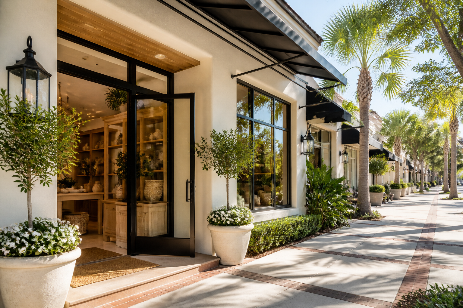
Your storefront and website are your first handshake with locals. Learn practical steps to polish both and boost trust fast.
First impressions set the course
In a small town like Port St. Lucie, your storefront and website are your most visible ambassadors. A friendly welcome mat—literally and online—goes a long way toward turning curious browsers into customers. You don’t need a big budget to make a strong, trustworthy first impression. You need a clear plan and a few focused improvements you can start this week.
Make your storefront speak clearly about you
- Quick curb appeal wins (this weekend): sweep the sidewalk, wash windows, remove clutter, trim shrubs, and replace or clean any faded signage. A tidy exterior says you care. - Signage readability: ensure exterior signs have high contrast and at least 3-inch lettering legible from 20–30 feet away. If a passerby can’t read your hours in a glance, they’ll move on. - Welcoming entrance: keep the entry door easy to find, with good lighting and a clear path. If you can, add a small welcome mat and a friendly, unobtrusive color that matches your branding. - Lighting after dark: warm, even lighting extends hours of perceived safety and makes your storefront feel inviting. Avoid harsh glare or dark corners. - Window displays that tell a story: rotate your window display at least once a month to showcase current offers, best sellers, or seasonal looks. Use simple props that reflect your brand’s promise. - Accessibility and flow: ensure there’s a step-free entry, clear doorway width, and visible directions for parking or curbside pickup. A few painted arrows or floor decals (if appropriate) can help. - Local flavor with consistency: incorporate Florida vibes—soft blues, sunlit yellows, or palm accents—without overcomplicating your signage. The goal is familiarity, not confusion.
Nail your website’s first impression
- Clear value proposition above the fold: within a few seconds, a visitor should understand what you offer and why you’re different. Replace vague statements with concrete benefits (e.g., “Same-day service in Port St. Lucie” or “Free in-store consultation”). - Mobile-friendly and fast: test your site on a phone and tablet. Large menus, readable fonts, and fast loading times keep people engaged. Aim for under 2 seconds for critical pages and compress large images. - Easy-to-find contact info and hours: put your phone number, address, and hours in the header or a dedicated contact bar. Use a click-to-call button on mobile and a visible map link. - Trust signals: show real customer reviews, case snippets, or testimonials. If you’re new to reviews, add a short “What customers say” section and invite local patrons to share feedback. - Real photos, not stock: use high-quality photos of your storefront, interior, and a few team moments. Authentic visuals beat generic stock every time and reinforce your local presence. - Clear calls to action: every page should guide visitors to the next step—“Call now,” “Book an appointment,” or “Visit us today.” Keep CTAs bright and easy to tap. - About page that feels human: include a short origin story, your connection to Port St. Lucie, and the people behind the business. People buy from people they feel they know. - Consistent branding: align colors, fonts, and imagery with your storefront. A consistent look reduces cognitive load and builds trust as customers move between storefront and site.
Build trust across both channels
- Consistent naming and NAP: ensure your business name, address, and phone number match across storefront signage, GBP (Google Business Profile), and your website. - Accessibility and safety: display certifications or safety practices when relevant (e.g., in-store sanitation, accessibility features). This reinforces care and reliability. - Local SEO alignment: optimize your GBP with up-to-date hours, photos, and services. Add a few local keywords naturally to your homepage content, like “Port St. Lucie handyman” or “local florist in PSL.” - Reviews as a growth tool: respond to reviews promptly and professionally, both positive and negative. It shows you listen and value customer experience. - Analytics to guide tweaks: use simple website analytics and a foot-traffic note from the storefront. Track which pages bring people in-store or drive calls; adjust accordingly.
30-day action plan you can start today
- Week 1: walk your exterior with a friend. Rate curb appeal, signage readability, and accessibility. Tackle two fast fixes (like window cleaning and lamp replacements). - Week 2: update a window display and take fresh exterior photos. Ensure photos reflect your current offerings and season. - Week 3: audit your homepage and GBP. Make a bold, clear value proposition above the fold and ensure hours, address, and phone are current. - Week 4: collect one new local review and craft a friendly reply. Refresh one in-store image on your site and align branding across channels.
Takeaway
First impressions are lasting, especially in a tight, local market. By aligning the look, feel, and messaging of both your storefront and your website, you create a cohesive, trustworthy brand that welcomes customers in and guides them to take action. Small, consistent improvements compound into real local wins.
Tip: Facebook caches previews. If the image doesn't show, use the Sharing Debugger and click "Scrape Again".